London Bikes Ride
An interactive Tableau dashboard for exploring London bike-share demand by time, weather, temperature, and wind conditions.
The question
Create an exploratory dashboard that lets a viewer choose any date range, smooth noisy ride counts, and see how demand changes with weather.
The approach
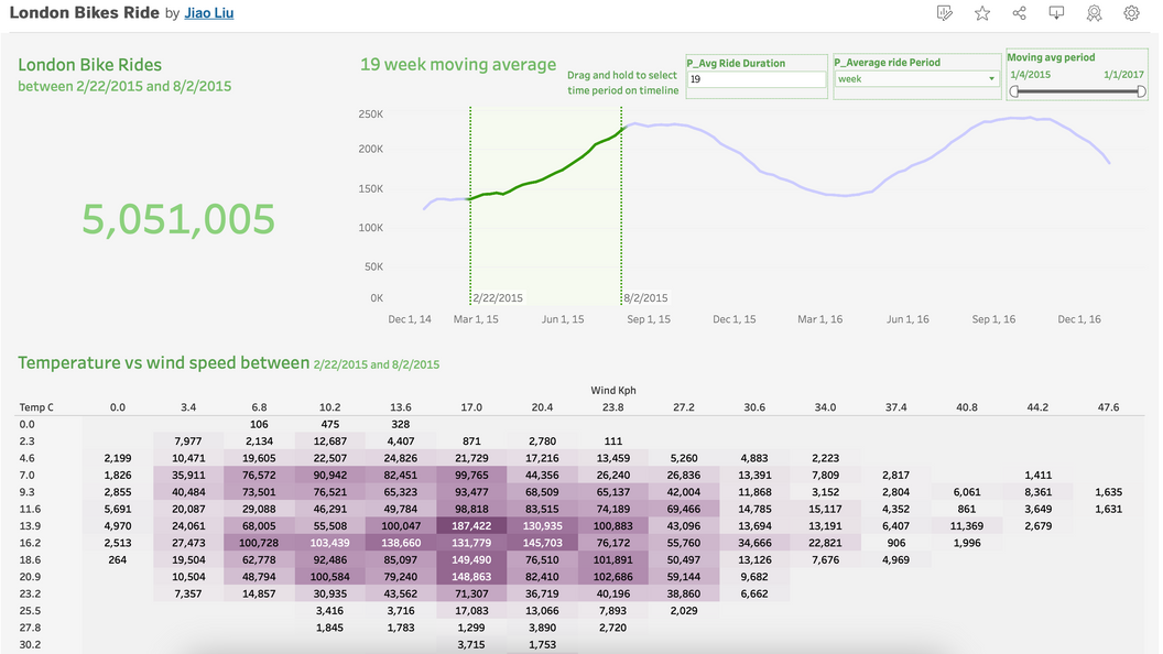
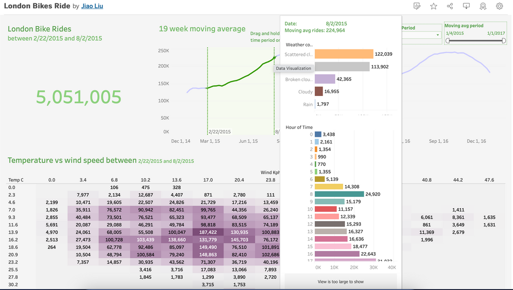
I built date-range parameters, a configurable moving average, weather and hour tooltips, and a temperature-versus-wind heatmap. Tableau calculations keep every view synchronized with the chosen range.
The outcome
The finished dashboard turns more than five million rides into a flexible demand explorer, supporting both broad trend reading and detailed weather-level inspection.
Analysis questions
What the work needed to answer.
- 01
How many rides occurred in a viewer-selected period?
- 02
What is the underlying demand trend after daily and weekly noise is smoothed?
- 03
How do temperature, wind, weather, and hour interact with ridership?
- 04
Can the whole dashboard respond consistently to one range selection?
Method
From raw data to a useful answer.
Make time selectable
Used DATETRUNC with a period parameter, then built minimum and maximum date bands for the selected range.
Smooth the signal
Created a configurable moving average with WINDOW_AVG so the viewer can change the rolling duration.
Connect conditions
Binned wind speed and combined it with temperature, weather, and hour to reveal demand patterns.
Keep views in sync
Applied a shared in-range calculation to total rides, trend lines, the heatmap, and interactive tooltips.
Results
What the analysis revealed.
Seasonality is unmistakable
Ride volume forms clear peaks and troughs over time; the moving average makes the broader cycle easier to interpret.
Weather needs context
The heatmap shows that temperature and wind work together, while weather-and-hour tooltips expose conditions hidden by averages.
Interaction improves analysis
A single selected date band updates totals and comparisons, so viewers can test a period without rebuilding the chart.
Smoothing is adjustable
The duration control lets viewers balance short-term movement against a more stable long-term demand signal.